DISCOVERY: THE IDEAL CLIENT HOMEPAGE
Scope: Empathize - Ideate Duration: 2 months (ongoing) Role: UX Researcher/Designer Platform: UBS Client Website Methodology: User Interviews
Overview:
In Q2 2025, I led a 2 month engagement to uncover critical opportunities to not only enhance, but reimagine the UBS client homepage.
“Clunky, outdated, hard to navigate”, this is what Financial Advisors would tell us our clients think. So we devised a brilliant idea. Let’s talk to clients and figure out what they actually want.
Through a series of 8 hour-long client interviews, we deep-dove on clients’ pain-points and needs as they pertained to using the UBS homepage. What came out of the interviews was an extensive set of opportunities to enhance the homepage in order to make navigation more efficient, make features / tools more informative, reduce clutter, and tell a better story of “How’s my portfolio doing.
Outcomes:
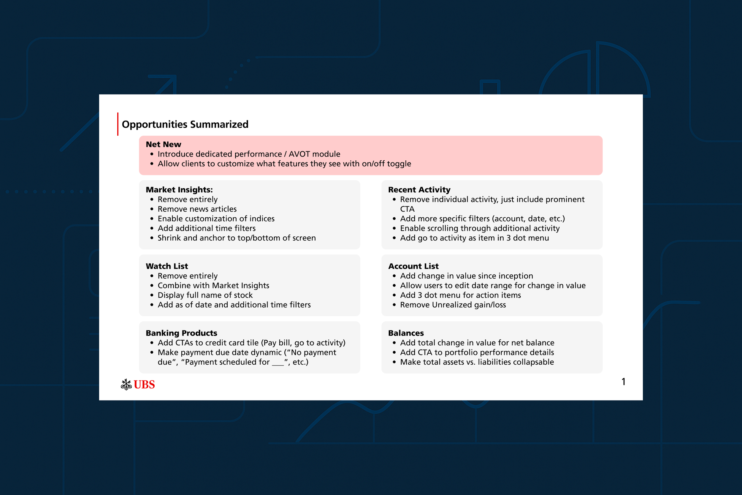
Uncovered key opportunities to enhance critical homepage features such as:
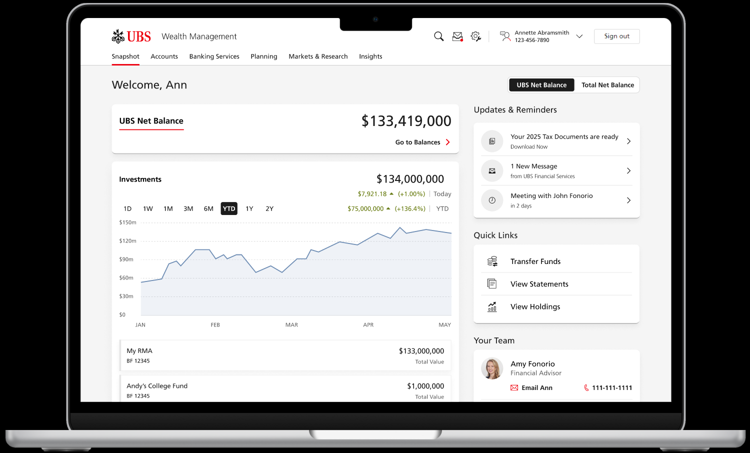
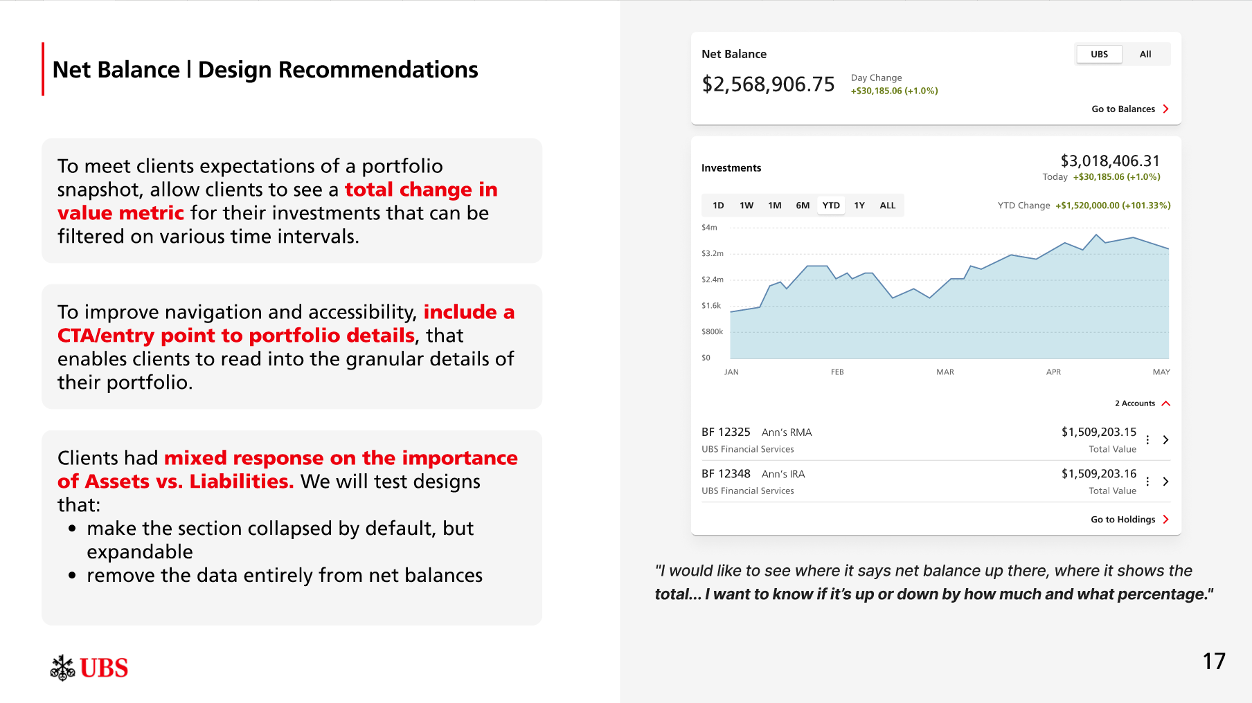
Net Balance
Portfolio performance (net new)
Account List
Recent Activity
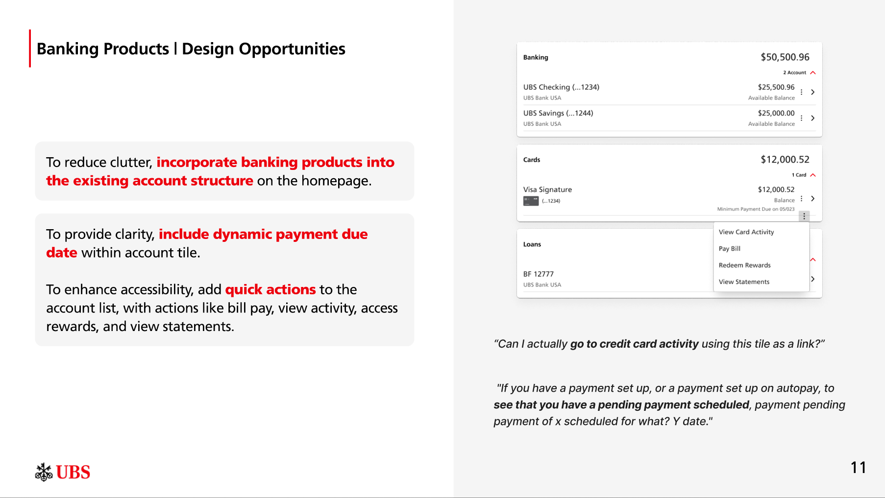
Banking Products
Watch List
Market Insights
Developed wire frames to test the above opportunities with clients in upcoming survey and usability test
Approach:
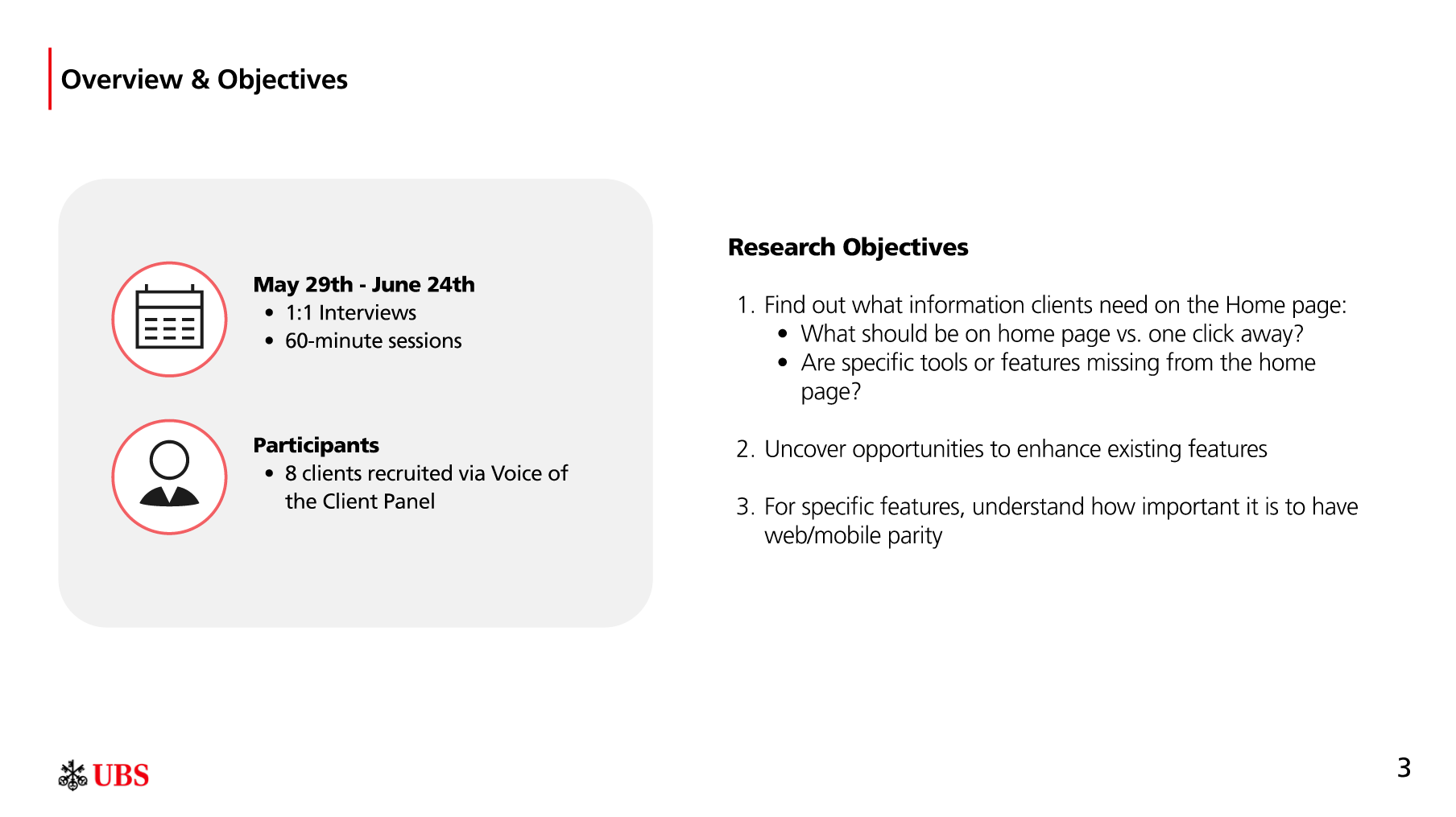
The project consisted of 2 phases - Discovery & Ideation (we are currently running a survey with 100 clients to collect feedback on opportunities surfaces from the user research).
The bulk of the project entailed me leading moderated user interviews with our clients in which I had an open and honest conversation about the homepage’s limitations, then went feature by feature and picked clients’ brains on how we might delight them.
After we synthesized our findings, we compiled a list of every possible opportunity to enhance the client experience, ranked them based off of feasibility and impact, and developed a set of early stage designs to test (in progress).
Objectives: I began my meeting with the product owners to align on what exactly their objectives were. They were pretty straight forward:
Discussion Guide:
From here, I developed a discussion guide that would allow us to get answers to the above. The guide consisted of 2 parts:
An open-ended discovery conversation. For the first 15 minutes, I asked high-level questions on:
Client behavior - how often do you login, what are you usually trying to do, how does the homepage support / degrade your experience?
What’s missing - are there certain things you’d expect to be on the homepage but aren’t? How do you
A feature evaluation. Feature by feature I asked clients a set of standardize questions, such as:
How often do you utilize this specific feature?
In what scenarios do you utilize this feature?
How well does this feature support your login tasks?
Are there certain data points, information, or functionality missing?
What would you change about this feature to enhance its usability?
Does this feature warrant being on the homepage?
User Interviews:
You can learn a lot about clients’ wants and needs if you actually sit down and listen to them. I began the conversations by asking clients what their current behaviors are and what their main objectives were when logging on to the website. Once I had my bearing, we began to deep dive on how the homepage could better support them in achieving those objectives. Feature by feature, clients told me how their ideal version would look and feel. What came out of the conversations was a prioritized set of opportunities for design updates that would create real, meaningful impact, based on the following client needs:
Performance:
Clients expect to be able to access figures such as account value over time and percentage up/down at the aggregate level, from the homepage. We talk about trust as one of our key pillars, but we don’t trust clients can handle the daily ups and downs of their portfolio?
Personalization:
Giving users a degree of control in terms of what they see on the homepage would help them focus on what matters most to them. Some features are inherently going to be less useful to certain clients, and that’s fine. Let them drive.
Focus:
A jack of all trades is a master of none. Clients don’t need everything on the homepage. Features like the watchlist and market insights lack visibility, are underutilized, and have poor perceived value even when noticed. What if we just remove them?
Based off each the 3 themes above and direct client feedback during the feature evaluation, we developed a set of redesign opportunities for each of the core components on the homepage - Net Balance, Account List, Cash Tile, Recent Activity, Banking Products, Watch List, and Market Insights. We presented our opportunities to stakeholders in the following format:
Next Steps (in progress):
Our work isn’t done yet. After we presented the findings to our product owners, I collaborated with our lead designer to develop mockups for each of our 14 recommendations that we are currently testing with clients.
As of writing this (Friday, August 15th), we have a live client survey that will give us thousands of data points on our proposed concepts. Once our survey is complete, we’ll have a strong POV on what direction we should head in for each enhancement / new feature. We will then develop functional prototypes to run usability tests on.
What I learned from this project:
This project emphasized the importance of a few principles that define best practices for UX research and design, both product and process-specific:
On a homepage, less is more — trying to do too much on the homepage creates fatigue and undesired cognitive load, and reduces the likelihood that clients will use features towards the bottom of the screen
Customization drives relevance — allowing clients to control what they see on the homepage signals highly valued personalization
Performance tells the portfolio story — clients feel their snapshot (one of the common login journeys) is incomplete if we’re not showing them account value over time and basic portfolio performance details