EMPOWERING CLIENT CASH MANAGEMENT
Scope: Empathize - Materialize Duration: 4 months Role: UX Researcher/Designer Platform: UBS Client Website Methodology: User Interviews, Prototyping, Usability Testing
Overview:
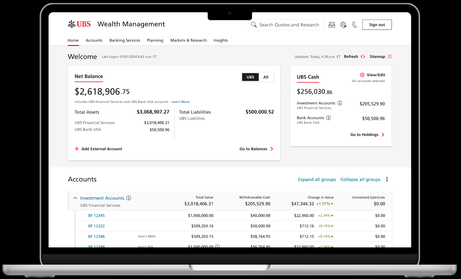
In Q4 2024, I led a 4 month project with the objective of enhancing the Cash Tile on UBS’ client website. Introduced in 2023, the cash tile was intended to give clients better visibility to their deployable cash sitting across their various accounts (the average UBS client has 6 accounts).
Through 4 phases of user research and prototyping, we delivered a dev-ready, client validated re-design in Jan 2025 that enable clients a significantly enhanced view into their cash deployment, from the homepage.
Outcomes:
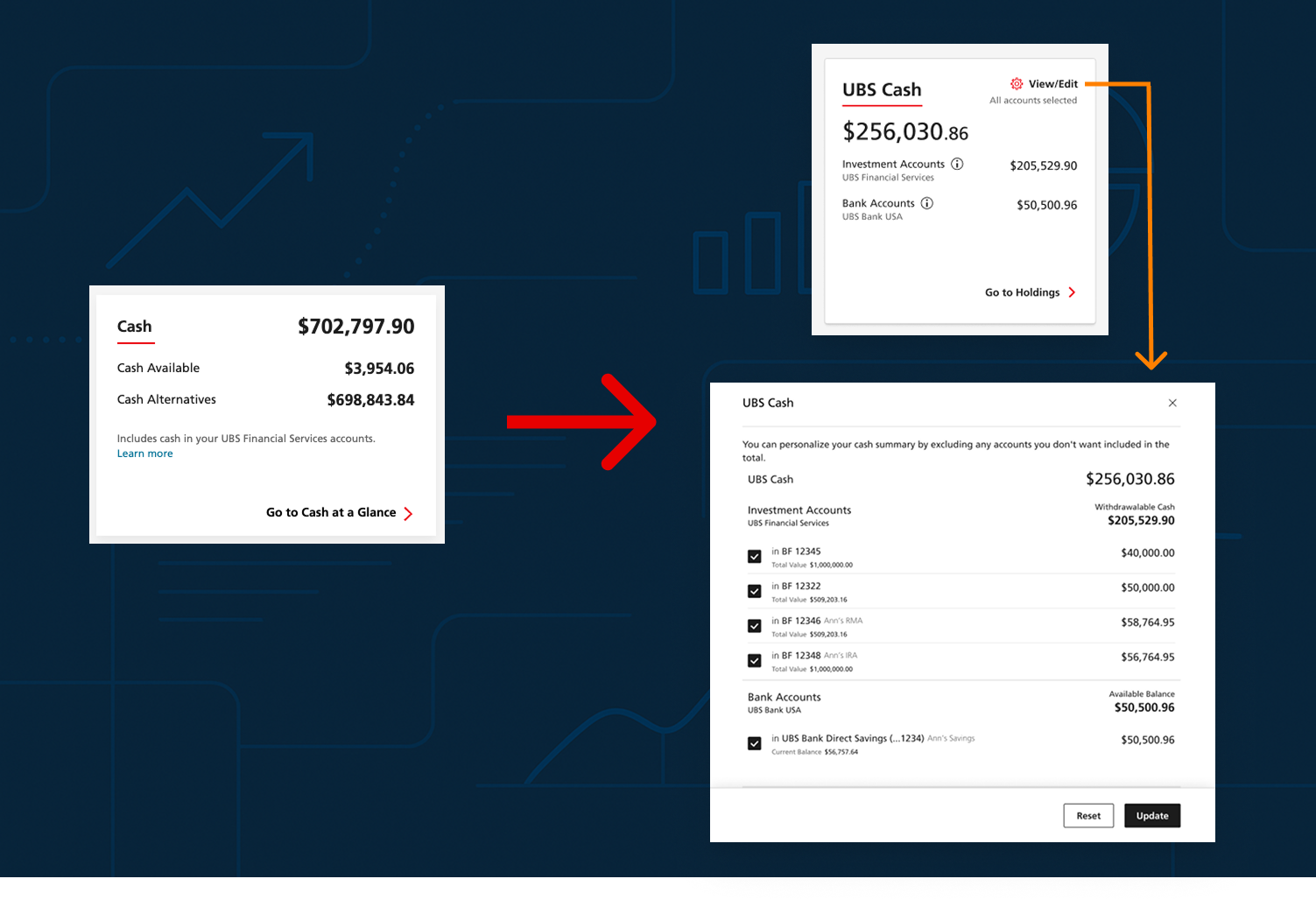
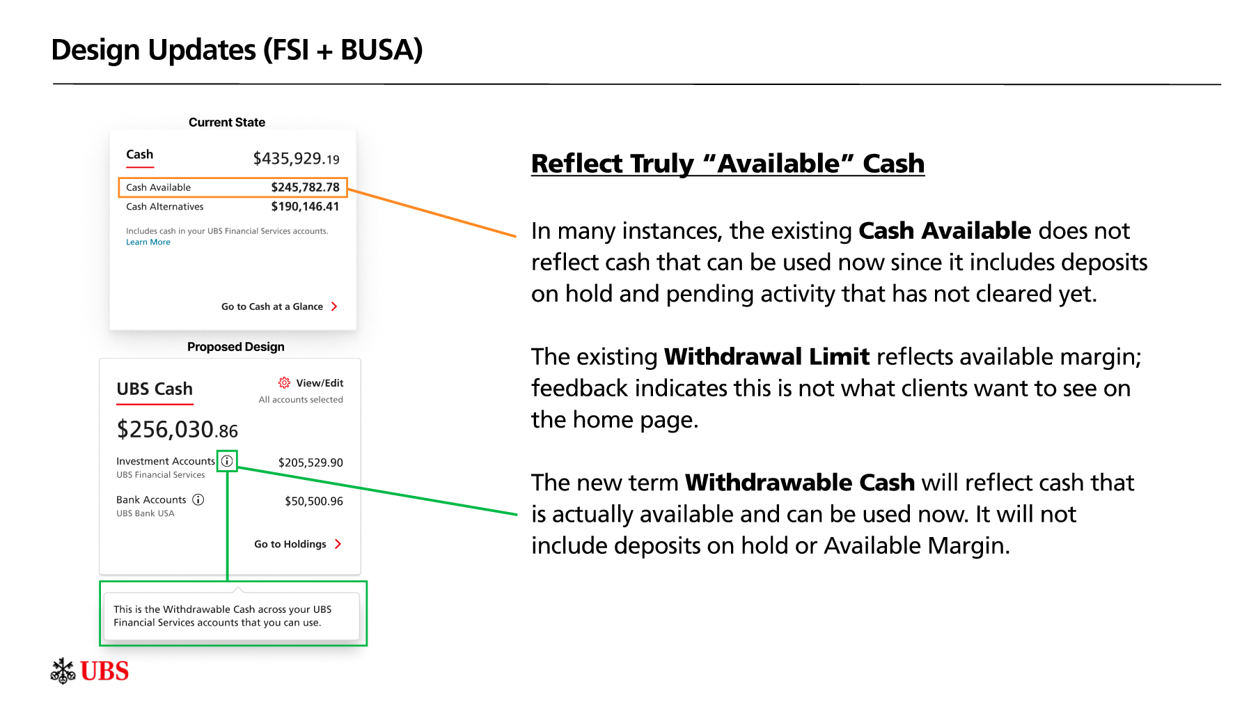
Introduced “Withdrawable Cash” metric excluding pending deposits and margin.
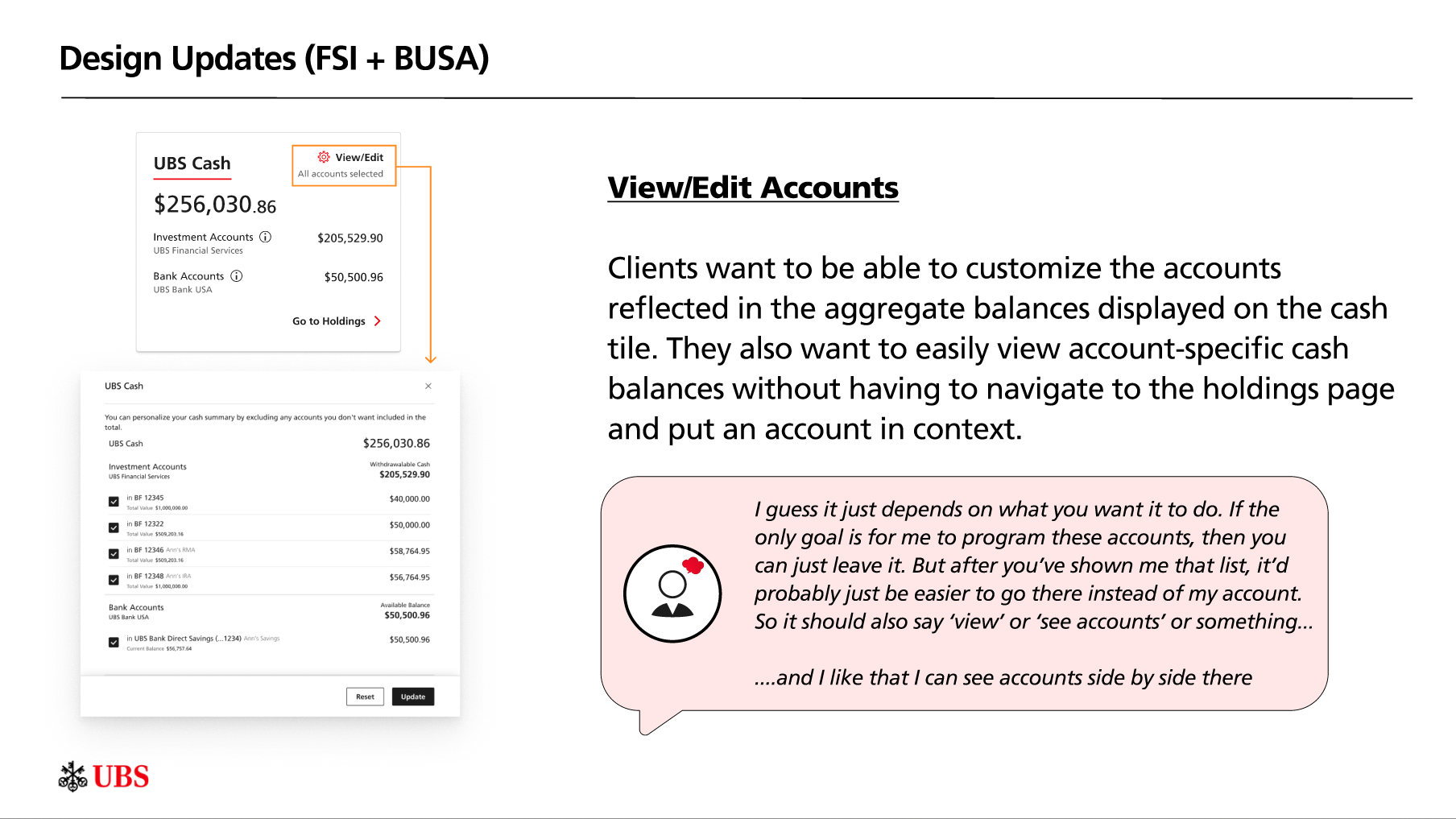
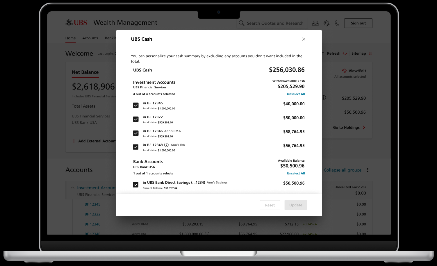
Added View/Edit Accounts feature so clients can customize which accounts contribute to aggregate balances.
Created account-type grouping (Investment vs. Bank) for clearer breakdowns.
Removed cash alternatives from the tile, focusing on actionable liquidity.
Updated navigation to link directly to the holdings page for detailed breakdowns.
Approach:
The project consisted of 4 phases - Discovery, Ideation, Testing, and validation. Each phase generated a set of key findings regarding client need, and each phase iterated on designs developed from the previous rounds’ findings. The end deliverable was a dev-ready prototype, which is now live in production.
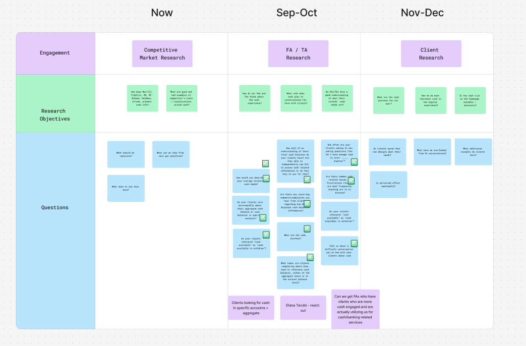
Discovery:
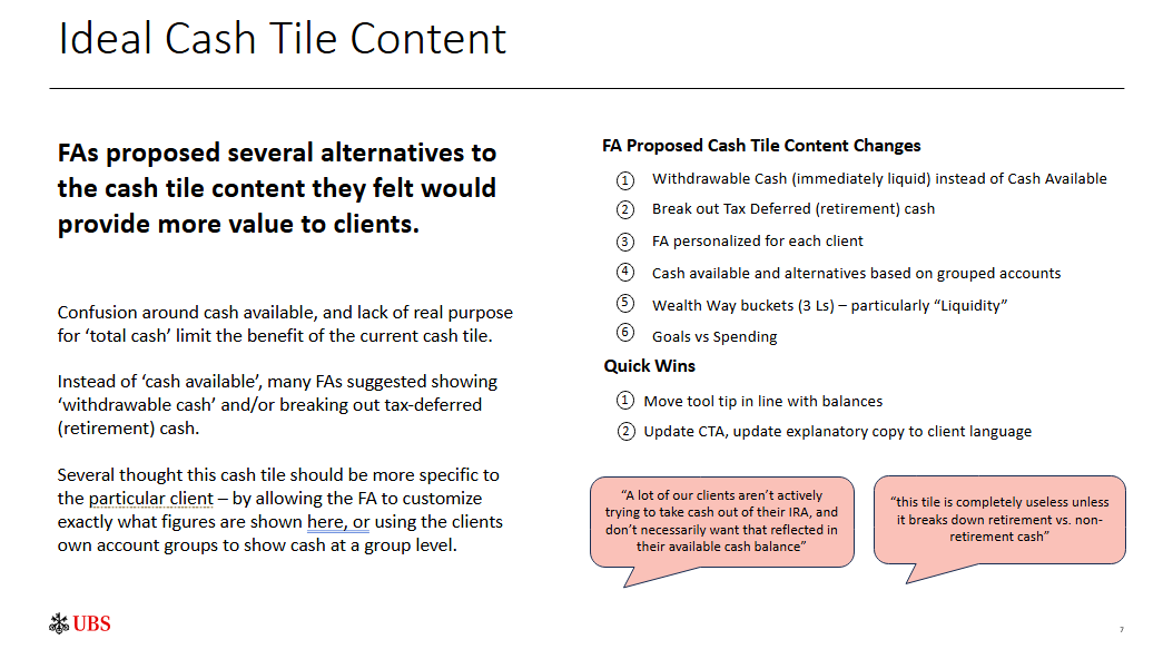
In the discovery phase, I met with 8 financial advisors to gather insight on what their clients’ biggest pain-points were in regard to accessing relevant cash information, on the home page. Our conversations covered a lot of ground, but we uncovered 2 critical insights that would remain sticky for the rest of our research and design.
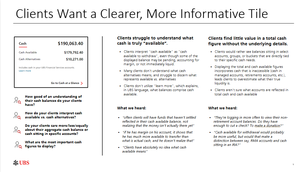
Clients struggle to understand what cash is actually available to deploy when looking at the aggregate figure displayed in the cash tile. Why? It includes funds that might be pending, funds in accounts that aren’t actually liquid (retirement accounts), and includes margin availability (borrowing power that most clients don’t even realize they have).
Clients want to be able to see account specific cash balances in addition to the aggregate figure. In most cases, they’ll have a primary spending account, so they want to be able to easily see that account’s cash balance.
Based off our findings, we constructed a set of opportunities that would address these 2 criticial client needs:
Ideation:
With our initial set of opportunities laid out, I collaborated with our lead designer to develop 2 concepts for a cash tile that would better address the existing clients needs. We put together 2 designs that:
Gave clients better visibility into what cash was truly available, by enabling them to deselect illiquid accounts from being represented in the total cash figure
Let them jump between the total cash figure and account-specific balances, while remaining on the homepage
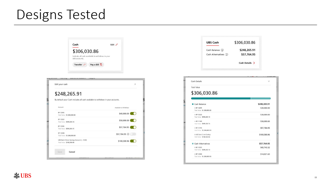
Once again, I hosted interviews with 8 financial advisors, this time with stimulus they could actually respond to. With our new designs, we deep dove on whether or not FAs felt they adequately addressed the client needs uncovered in our previous round of research. We got a lot of positive feedback, and utilized new suggestions to develop a revised design that combined the best of both designs.
Testing:
Now that we were confidant we had a strong design that would address our clients’ most critical pain-points, it was time to put that theory to the test. I hosted in depth user interview with 8 UBS clients, who covered the 2 primary personas the cash tile is intended to represent. We asked clients questions like:
Can you tell us how much liquid cash there is in ______ account? Where would you expect to find this answer?
What accounts do you think are represented in this total figure? What accounts should be represented in this total figure?
It is clear that you can customize the account representation? If not, how could we make it easier to personalize the total figure?
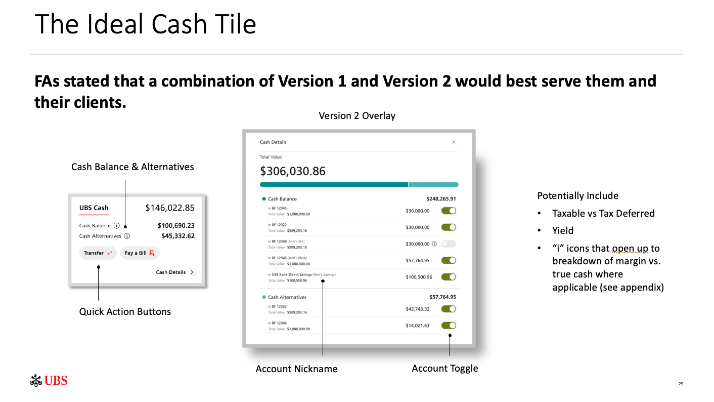
While our designs were seen as an overwhelming improvement to what currently existed, clients gave us critical feedback on a few major points:
The CTA that brings you from cash tile —> account overlay should be more explicit. Clients didn’t realize that “Cash Details” meant “click this to see your account balances and customize your view”
The distinction between cash available (sitting liquid cash) and cash alternatives (cash in fixed-yield products like CDs, bonds, money markets, etc.) isn’t relevant enough to sit on the homepage. The distinction clients actually care about is cash in their investment accounts and cash in their bank accounts.
With these considerations, I collaborated again with our lead designer to refine our existing designs, and landed on the following updates:
Validation:
With our design refined based off of 3 rounds of feedback, it was time to finalize it. Once again, we met with a set of clients to pressure test our design and address edge cases. We asked questions like:
If you didn’t have an active bank account at UBS, would you rather we display that figure as $0.00 or just remove it from the tile?
Do the terms withdrawable cash vs. available balance (legal terms we have to use to distinguish cash in investment accounts vs. bank accounts, respectively) make sense to you?
Are you able easily navigate to account details to access cash alternatives now that they are removed from the tile?
After meeting with clients, we made small tweaks to copy of specific balances and CTAs. 4 months later, we put the following design in front of our legal team, and formally submitted it for a compliance review.
What I learned from this project:
This project emphasized the importance of a few principles that define best practices for UX research and design, both product and process-specific:
Terminology clarity is critical — even small language changes can shift user trust and comprehension.
Customization drives relevance — allowing clients to control data sources increased perceived value.
Less can be more — removing low-priority data (cash alternatives) improved focus and comprehension.
Iterative feedback loops between FAs and clients ensured alignment across user types.